Thanks @johnSSG !
I have found what the problem was so I want to share in case it can help others.
(Actually, before posting I tried simplifying all of my CSS but it would didn’t help)
The case
As mentioned on the initial post, adding: interactive-widget=resizes-content, did seem to help, but not sure if it was a browser update or what happened that it started breaking again.
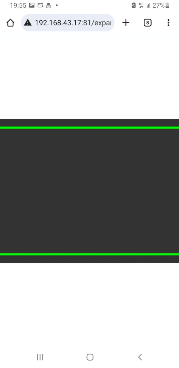
Additionally, upgrading from Phaser 3.88.2 to 3.90.0 would break in a different way (see last image).
My UI requirements were:
- Use whole visible area, no matter the resolution. (using scale.EXPAND)
- It would adapt to the corresonding orientation (responsive)
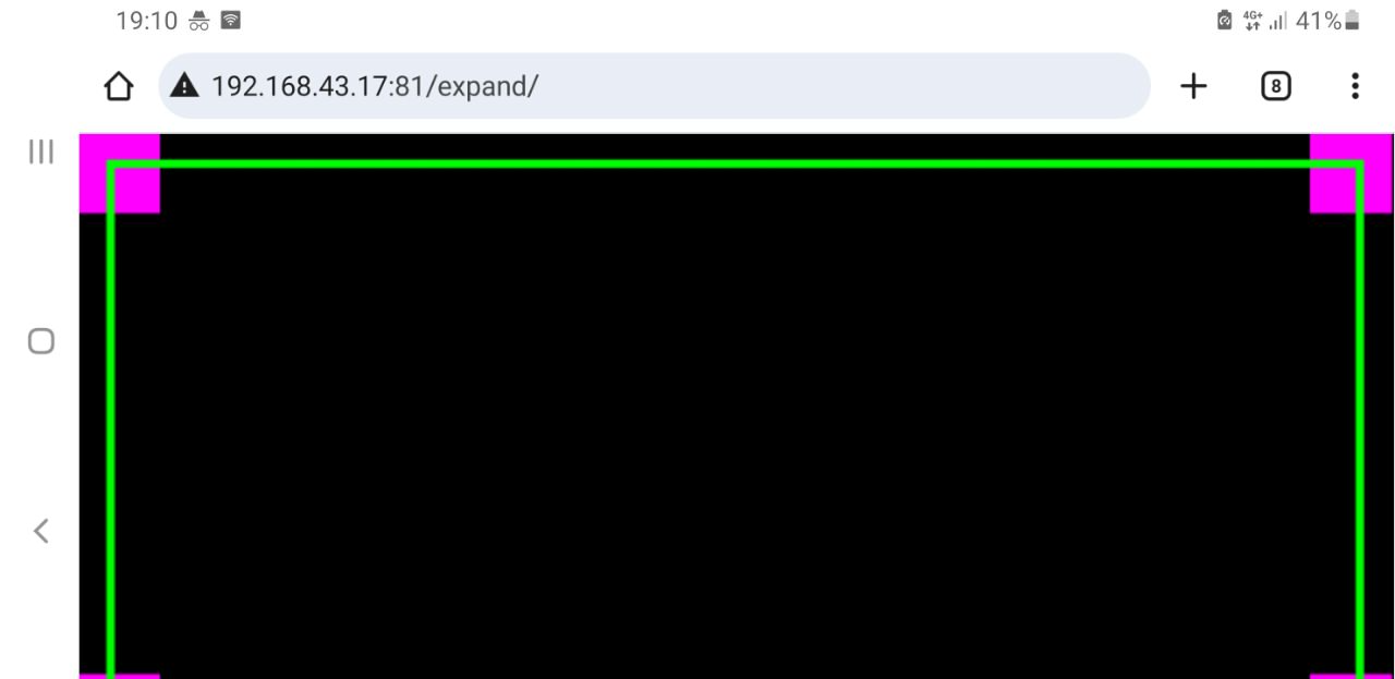
Essentially, on rotation, the screen was shifting like below:
Initial load on landscape orientation
Rotate to portrait (still fine)
Roating to landscape again breaks
When using Phaser 3.90.0, rotating would behave differently:
My offending (simplified) config was:
import * as Phaser from 'phaser';

import MainScene from './scripts/scenes/main-scene'
import PreloadScene from './scripts/scenes/preload-scene'
import StartScene from './scripts/scenes/start-scene'
import {environment} from "../environments/environment"

const DEFAULT_GAME_WIDTH = 1920
const DEFAULT_GAME_HEIGHT = 1080
const MIN_WIDTH = 320
const MIN_HEIGHT = 240
const MAX_WIDTH = window.innerWidth * window.devicePixelRatio
const MAX_HEIGHT = window.innerHeight * window.devicePixelRatio

// Detect iOS devices (or any mobile-like touch device)
const isIOS = /iPad|iPhone|iPod/.test(navigator.userAgent) ||
    (navigator.userAgent.includes('Mac') && 'ontouchend' in document)
const isDesktop = !/Mobi|Android/i.test(navigator.userAgent)

// Build the scale config conditionally
const scaleConfig = isDesktop
    ? {
      parent: 'game-container',
      mode: Phaser.Scale.ScaleModes.EXPAND,
      autoCenter: Phaser.Scale.CENTER_BOTH,
    }
    : {
      parent: 'game-container',
      mode: Phaser.Scale.ScaleModes.EXPAND,
      autoCenter: Phaser.Scale.CENTER_BOTH,
      // For mobile, use min/max values to adapt to varying screen sizes.
      min: {width: MIN_WIDTH, height: MIN_HEIGHT},
      max: {width: MAX_WIDTH, height: MAX_HEIGHT},
    }

const config: Phaser.Types.Core.GameConfig = {
  type: Phaser.AUTO,

  dom: {createContainer: true},
  backgroundColor: 'rgba(2, 2, 2, 0)',
  transparent: true,
  audio: {noAudio: true},
  fullscreenTarget: 'app-home',
  scale: scaleConfig,
  scene: [
    PreloadScene,
    MainScene,
    StartScene,
  ],
  input: {
    gamepad: true,
    mouse: true,
    touch: true,
    windowEvents: false
  },
}

// Only add fixed width/height for desktop
if (isDesktop) {
  config.width = DEFAULT_GAME_WIDTH
  config.height = DEFAULT_GAME_HEIGHT
}

const StartGame = (parent: string) => {
  const game = new Phaser.Game({...config, parent})
  if (!environment.production) (window as any).game = game
  return game
}

export {StartGame, DEFAULT_GAME_HEIGHT}
So the case is I added the min/max settings for mobile, since the game started to crash with: Framebuffer status: Incomplete Attachment error.
Things worked partially well with that fix, but upgrading to latest Phaser (3.90.0 at this time) would break differently.
Since 3.90.0 fixed the Scale.EXPAND issue which was blowing up the framebuffer (see Ability to limit canvas size for Expand scale mode. · Issue #7027 · phaserjs/phaser · GitHub), I just tried upgrading again and removing all scaling min/max constraints and now it works!
This is my current scaling config and it finally works as expected:
  scale: {
    parent: 'game-container',
    mode: Phaser.Scale.ScaleModes.EXPAND,
    autoCenter: Phaser.Scale.CENTER_BOTH,
  },
It took me a really long time to discover and fix, since I was carrying old workarounds (setting min/max width/height) to overcome the framebuffer crash, but also having those values was definitely affecting how the canvas would look like when rotating the device.
So in conclusion, my advise for anyone running into similar issues would be: if you don’t have a really good reason and know how to play with min/max heights/widths for scaling, just avoid using them completely.
Hope this helps someone save time!
All the best


